I thought it might be useful to do a few posts on usability testing, with a discussion on how each method of testing contributes to the e-learning world. Whenever you’re testing, it’s best to have testers that approximate (or, better yet, who are part of) the intended users of the learning. The beauty of this type of testing is that you can find most of the issues with testing only 5 users or less. This week, I’m going to cover the basics of paper prototyping for e-learning.
Paper prototyping is a common method utilized in the human-computer interface world – but how often do we use this method for testing learning designs with real users? I recommend paper prototyping as a cheap, easy-to-implement way to detect usability problems, scope issues, and any issues with information architecture. So how do you get started with paper prototype testing?
Paper prototyping isn’t difficult, but you do have to do some preparatory steps.
- First, you will need a list of the common tasks users may need to “do” in your interface. This might include finding information, passing a quiz, or completing an activity. If you have actual users, you may also ask them what other tasks they might expect to complete with the interface.
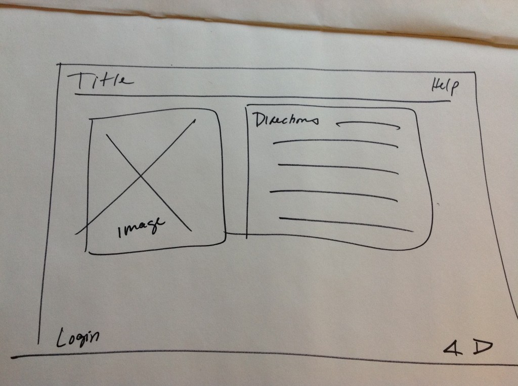
- Next, you have paper versions (these can be sketches) of what you expect the learning module or course to look like. It should include a menu and any buttons that are going to be part of the interface. Each piece of paper should have a rough sketch of where you would go if you clicked any button. Thus, if you have a “Next” button, then you would have another piece of paper that has the interface if the “Next” button were pressed.

A rough sketch of an interface -

A paper prototype of a mobile interface Finally, you give the users the task they are supposed to complete, such as “Find the information about when the next training is to take place” and hand them the home screen. The user should point to where they would click, and then you replace the first paper with whatever they might see if that button/link were pressed. This process continues, while the tester notes issues or other difficulties with the interface. The user is also asked for feedback.
This kind of collaborative testing doesn’t take long, is cost-effective, and can find some obvious issues with interfaces. In addition, it offers the designer and developer the opportunity to hear from the users regarding what they prefer in the interface they may be using. Why not try it for your next project?
More information on paper prototyping: http://www.alistapart.com/articles/paperprototyping/
Next post, we’ll take a look at the different ways to use card sorts to organize content for e-learning. I hope you’ll plan to stop by!

Lessons for eLearning. Learning from the Web World: Paper Prototyping: http://t.co/HXYBAq9P
Nice post on paper prototyping in elearning by @StevieR http://t.co/BCxPbgD1
Lessons for #eLearning. Learning from the Web World: Paper Prototyping: http://t.co/cC7iXAy6 @stevier